
Introduction to ggplot2 - I
Lecture 1
Layered grammar of graphics

ggplot2 builds complex plots iteratively, one layer at a time.
What are the necessary components of a plot?
What are necessary components of a layer?
Components of a plot
A plot contains:
Data and aesthetic mapping
Layer(s) containing geometric object(s) and statistical transformation(s)
Scales
Coordinate system
(Optional) facets or themes
Components of a layer

A layer contains:
Data with aesthetic mapping
A statistical transformation, or stat
A geometric object, or geom
A position adjustment
Example dataset - mapped
# A tibble: 6 × 4
  Color         x     y  Size
  <fct>     <dbl> <dbl> <int>
1 Adelie     39.1  18.7  3750
2 Adelie     39.5  17.4  3800
3 Gentoo     46.7  15.3  5200
4 Gentoo     43.3  13.4  4400
5 Chinstrap  46.1  18.2  3250
6 Chinstrap  51.3  18.2  3750
Warning: Removed 2 rows containing missing values (`geom_point()`).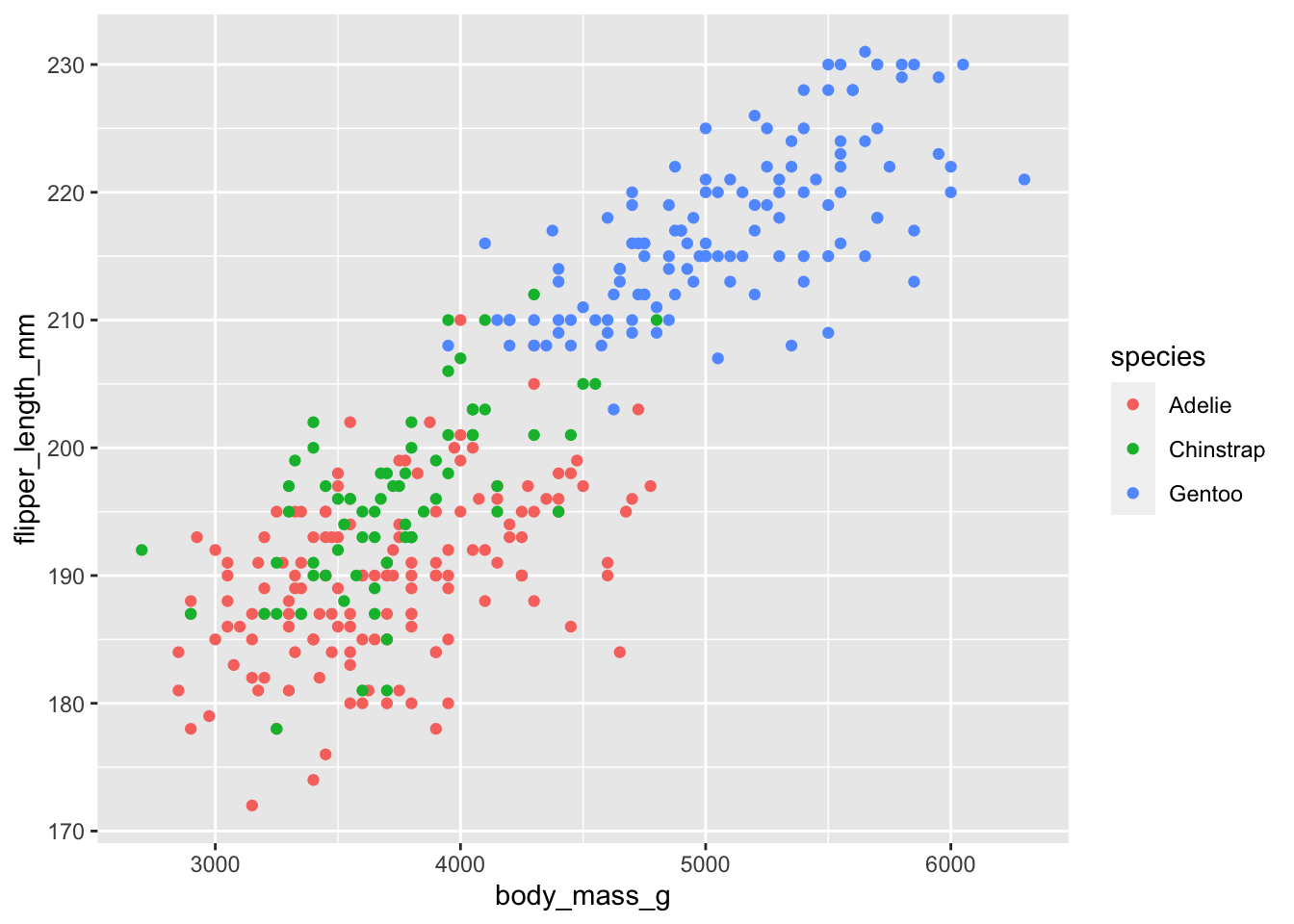
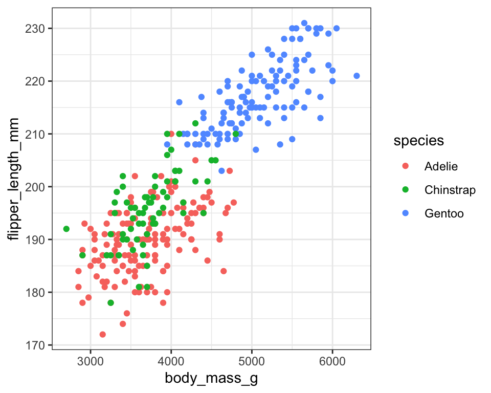
Inheritance of aesthetics by layers
ggplot(penguins, aes(x = body_mass_g, y = flipper_length_mm,
                     color = species)) +
geom_point() +
geom_smooth(method = "lm", se = FALSE) `geom_smooth()` using formula = 'y ~ x'Warning: Removed 2 rows containing non-finite values (`stat_smooth()`).Warning: Removed 2 rows containing missing values (`geom_point()`).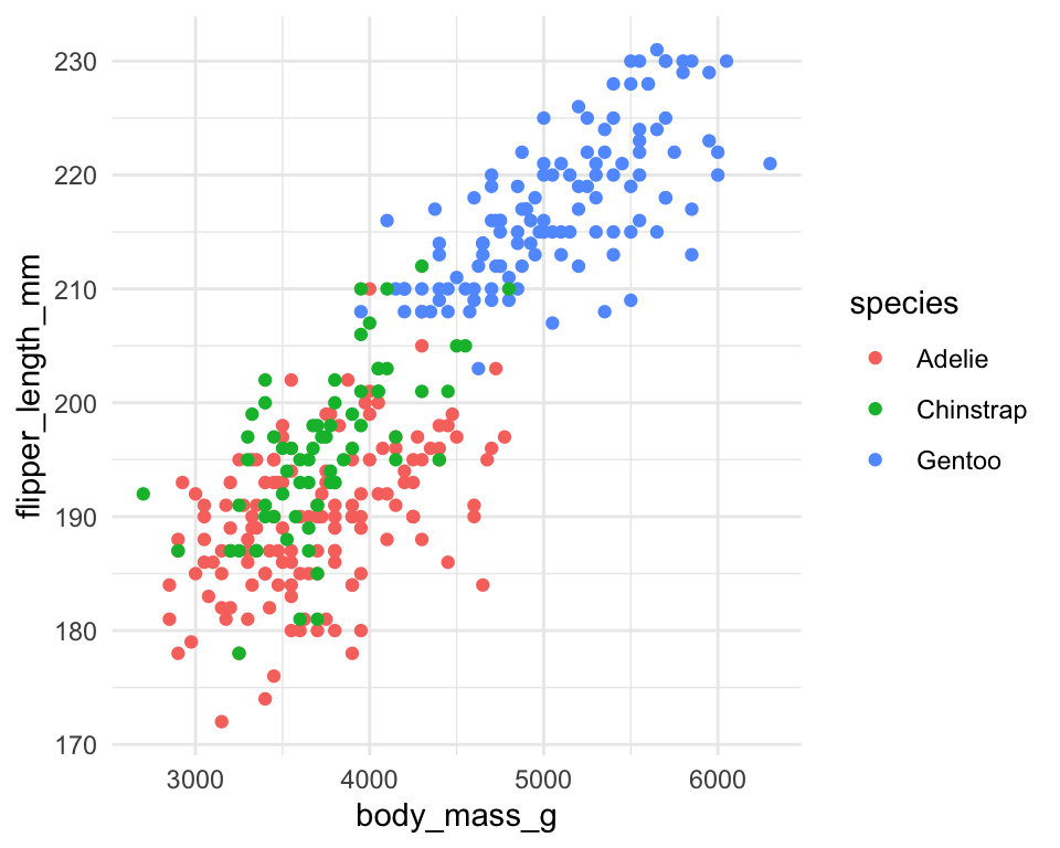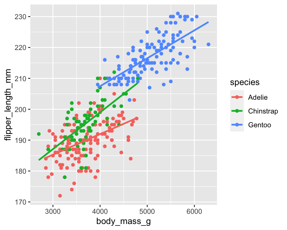
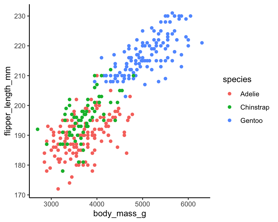
ggplot(penguins, aes(x = body_mass_g, y = flipper_length_mm)) +
geom_point(aes(color = species)) +
geom_smooth(method = "lm",
se = FALSE) `geom_smooth()` using formula = 'y ~ x'Warning: Removed 2 rows containing non-finite values (`stat_smooth()`).Warning: Removed 2 rows containing missing values (`geom_point()`).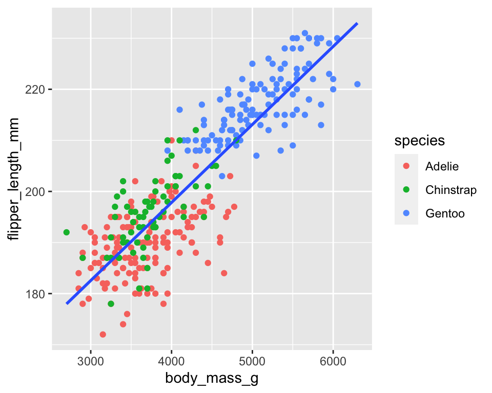
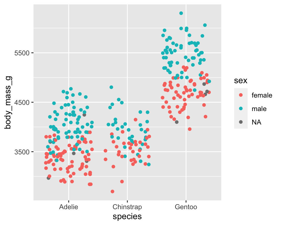
Mapping aesthetics to constants
Specifying a constant inside aes() with quotes creates a legend on the fly
Warning: Removed 2 rows containing missing values (`geom_point()`).
Removed 2 rows containing missing values (`geom_point()`).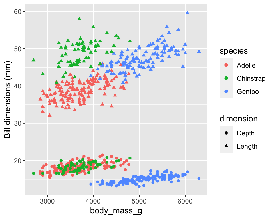
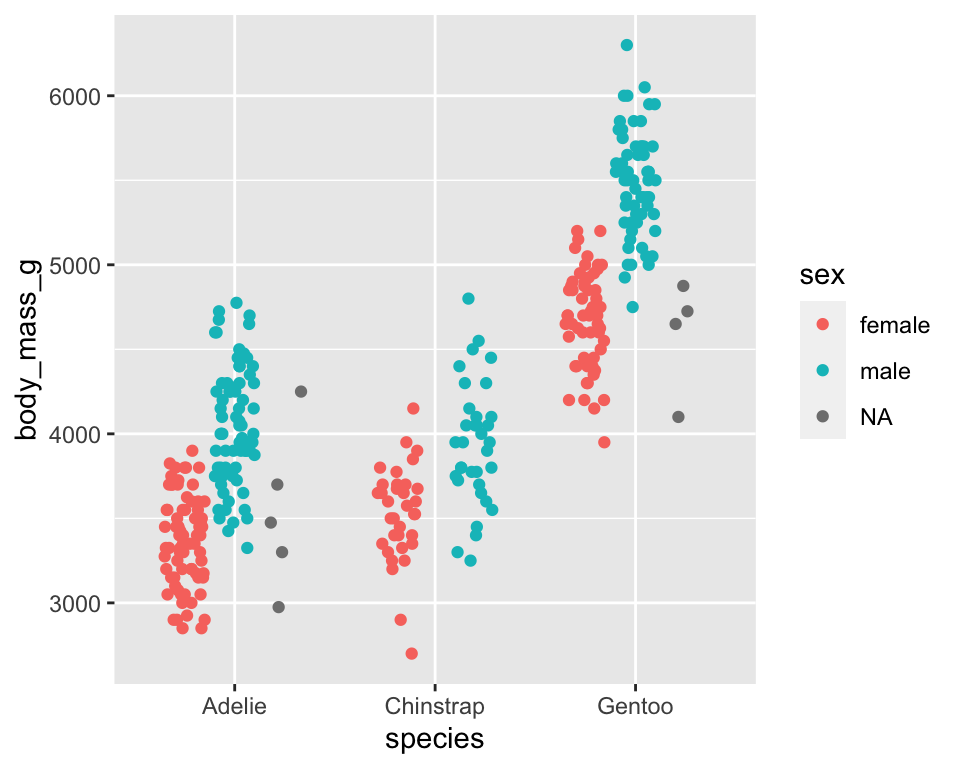
The expediency of defaults
Defining each of the components of a layer or whole graphic can be tiresome
ggplot2has a hierarchy of defaultsSo you can make a graph in 2 lines of code!
Warning: Removed 2 rows containing missing values (`geom_point()`).
The short way and the long way
Warning: Removed 2 rows containing missing values (`geom_point()`).
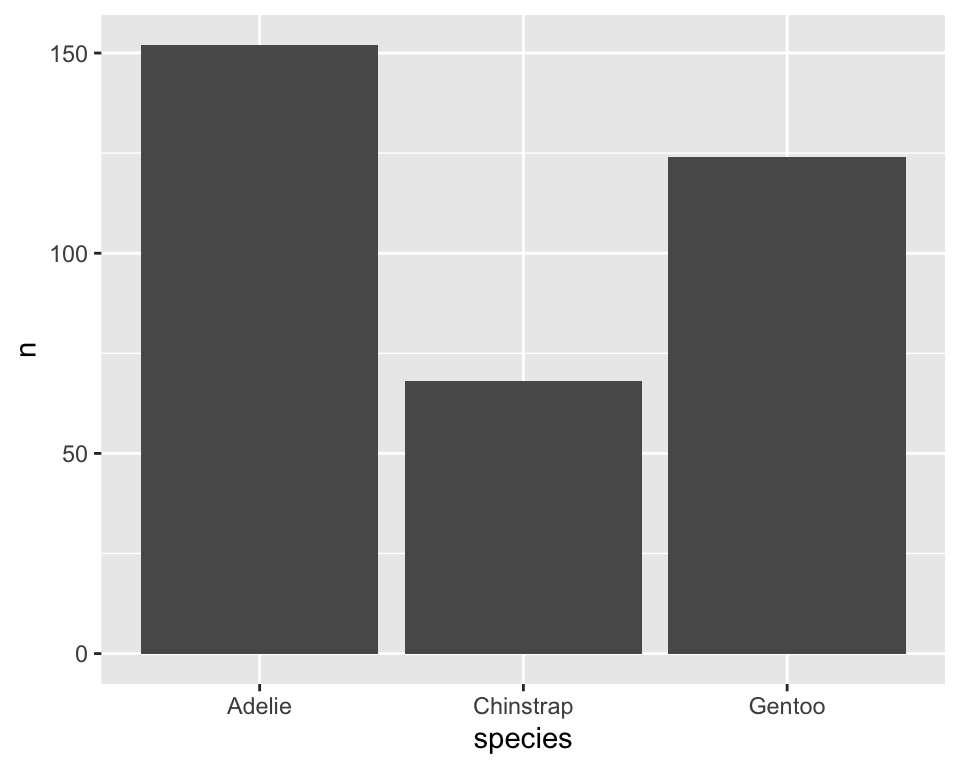
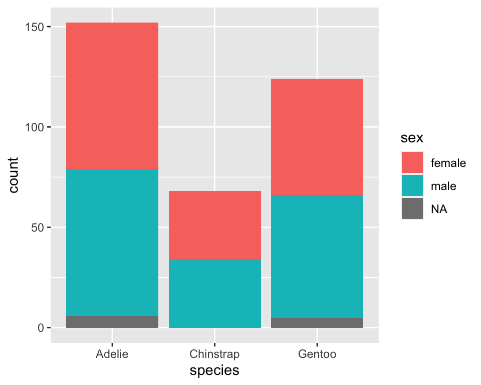
Two ways to plot counts (categorical)
stat_count() and geom_bar() are equivalent


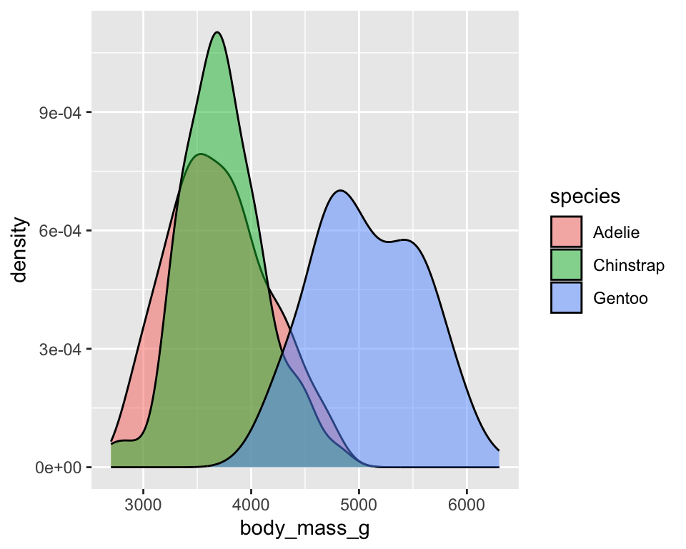
Two ways to plot density (continuous)
stat_density() and geom_density() are not equivalent
When to use which?
In general, use geom_*() unless you are trying to:
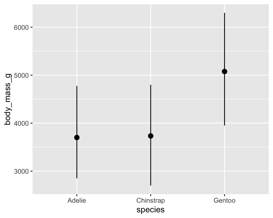
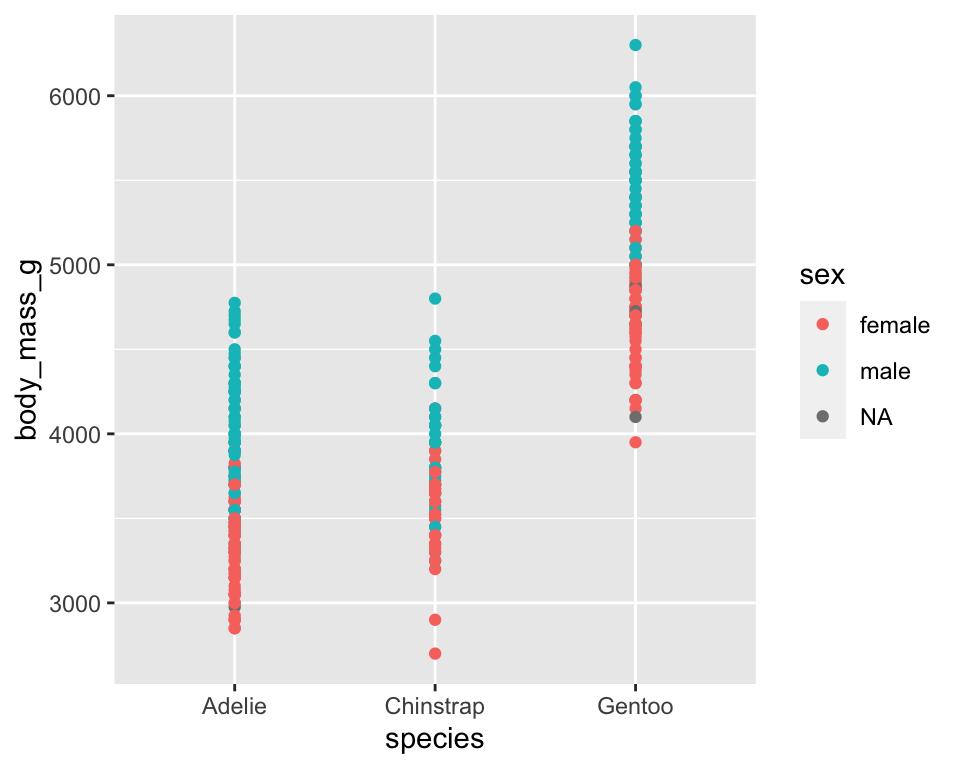
Position adjustment options
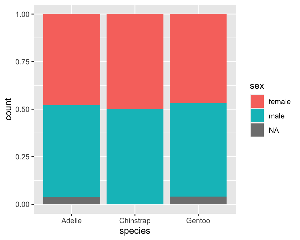
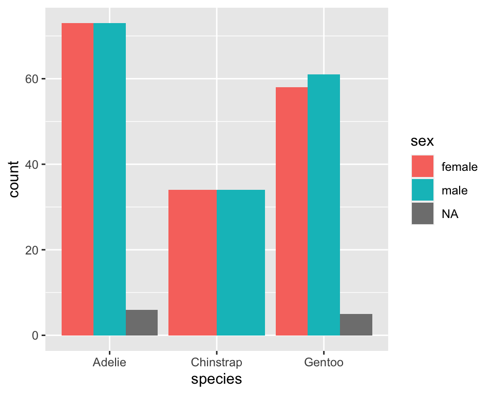
Position adjustment options
Recreating a layered plot
── Attaching core tidyverse packages ──────────────────────── tidyverse 2.0.0 ──
✔ forcats   1.0.0     ✔ stringr   1.5.0
✔ lubridate 1.9.2     ✔ tibble    3.2.1
✔ purrr     1.0.1     ✔ tidyr     1.3.0
✔ readr     2.1.4
── Conflicts ────────────────────────────────────────── tidyverse_conflicts() ──
✖ dplyr::filter() masks stats::filter()
✖ dplyr::lag()    masks stats::lag()
ℹ Use the conflicted package (<http://conflicted.r-lib.org/>) to force all conflicts to become errors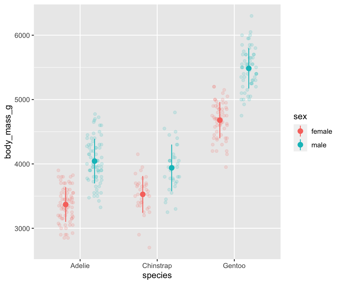
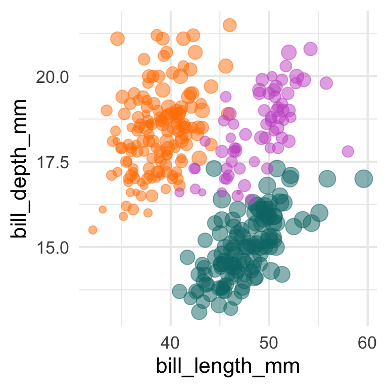
Exercise
What are the two layers in this plot? What data when into each?
Scales and guides
Each scale is a function that translate data space (in data units) into aesthetic space (e.g., pixels)
A guide (axis or legend) is the inverse function, that converts visual properties back to data

Are axes and legends equivalent?
Faceting
Creates small multiples to show different subsets:
facet_null(): defaultfacet_wrap(): “wraps” a 1d ribbon of panels into 2dfacet_grid(): 2d grid of panels defined by row and column

Keeping points of reference
Exercise
Recreate the figure below. How would you get the gray points to show up on all facets?
Warning: Removed 6 rows containing missing values (`geom_point()`).Warning: Removed 2 rows containing missing values (`geom_point()`).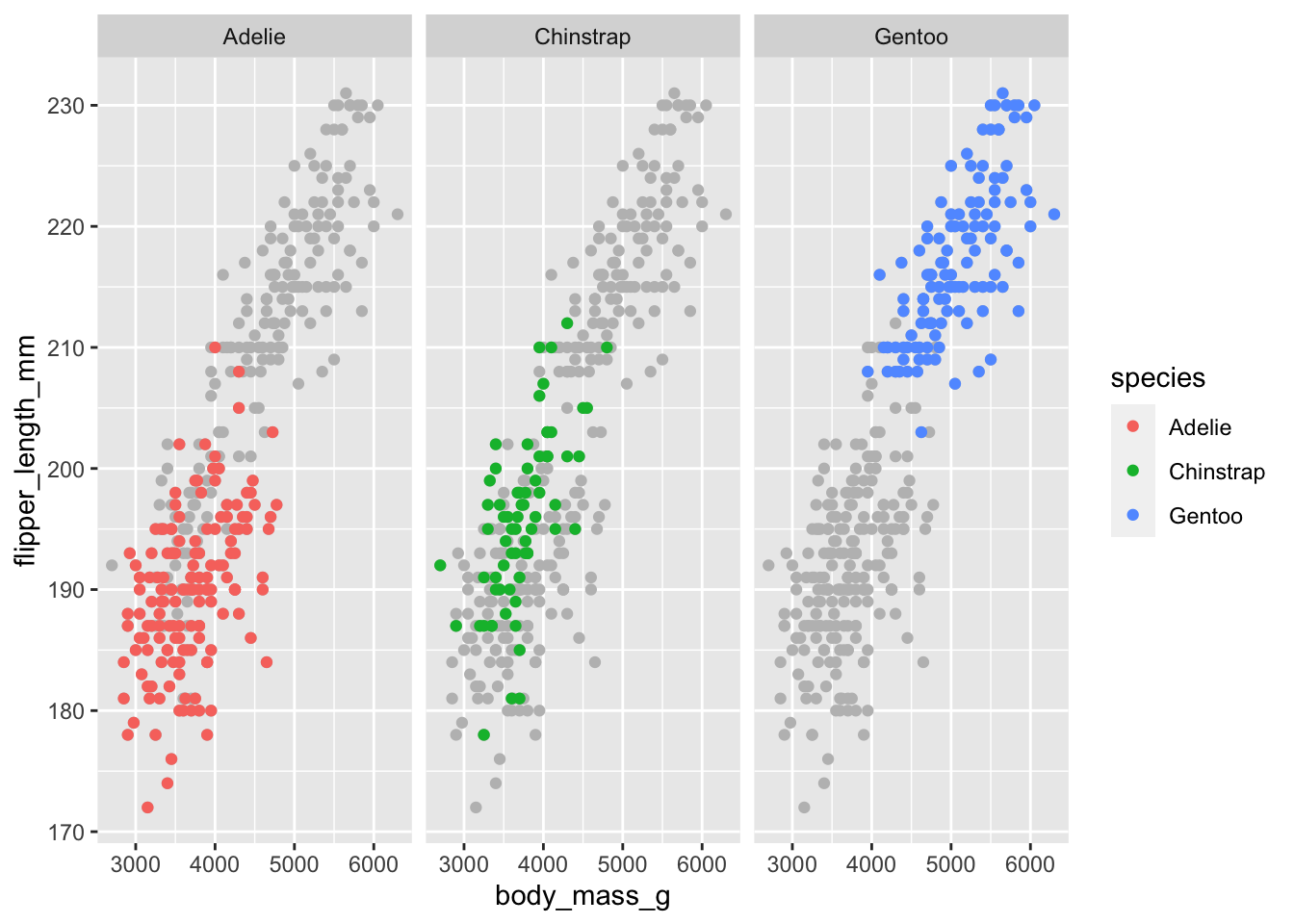
Complete themes
Further resources
Penguin artwork by @allison_horst
Hadley Wickham’s “A layered grammar of graphics” (2010)
Hadley Wickham’s “ggplot2: Elegant Graphics for Data Analysis, 3rd edition”, now available online
“R for Data Science”, by Hadley Wickham, Mine Cetinkaya-Rundel, & Garret Grolemund, especially chapters 2, 10, and 12